Modals
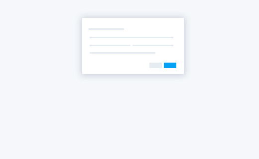
Basic Modal
Modals are streamlined, but flexible, dialog prompts with the minimum required functionality and smart defaults. You can use a modal for dialog boxes, confirmation messages, or other content that can be called up.
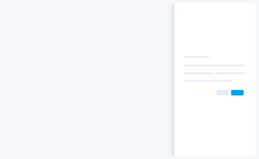
Side Modal Right
This is side modal with right slide in animation. Applies .modal-right to .modal. Modal backdrop is removable by adding .no-backdrop class.
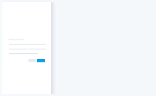
Side Modal Left
This is side modal with left slide in animation. Applies .modal-left to .modal.
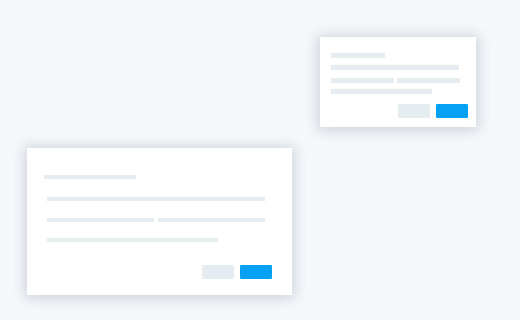
Optional Sizes
Modals have two optional sizes, available .modal-sm & .modal-lg classes to be placed on a .modal-dialog. These sizes kick in at certain breakpoints to avoid horizontal scrollbars on narrower viewports.
Full Screen Modal
Modals have two optional sizes, available .modal-sm & .modal-lg classes to be placed on a .modal-dialog. These sizes kick in at certain breakpoints to avoid horizontal scrollbars on narrower viewports.
